Accessibility decisions made without you
Voice control hears “click Next.” Nothing happens: a well-meant label made your button answer to “Continue.” That label is yours, but ARIA decided the rest.
<button aria-label="Continue">Next</button>Role, keyboard activation, accessible name. The browser gives you all three for free. Assistive tech works from the name, and aria-label overrides the visible text, so speech input expects “Continue,” the same word a screen reader would announce.
Voice is the only way some people operate a computer. For others it’s temporary or situational: a wrist in a cast, a flare of pain, both hands full.
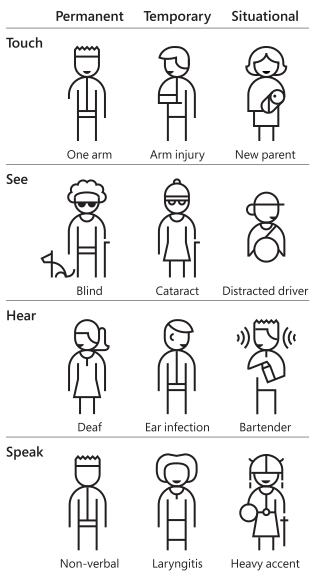
The Persona Spectrum, from Microsoft’s Inclusive 101 guidebook. © Microsoft 2016, CC BY-NC-ND
The mismatch between label and content stops all of them, and the Web Content Accessibility Guidelines cover that failure under Label in Name. WCAG grades its criteria A, AA, or AAA. This one is Level A, the bare minimum.
There’s a linter rule for this. axe-core, the rules engine behind a lot of automated accessibility checks, calls it label-content-name-mismatch, and its maintainer, Deque, rates the failure Serious. It’s tagged experimental, though, and the rule list says what that means: those rules “are disabled by default in axe-core and the axe browser extensions.”
Somebody decided that. Not a standards body but a maintainer, weighing false positives against real ones in a config most teams never open.
Calls like that get made without you all the time. The question is where the judgment lives, and what it takes to disagree with it.
Conformant is not accessible
Code can pass every check and still fail the people it was written for. Adrian Roselli calls that “uncanny a11y”, after the uncanny valley, where almost human is creepier than obviously fake.
You’ll find examples in any codebase that survived an audit. tabindex="0" on headings and table cells, scrambling the tab order to add keyboard support that screen readers already provide, as Léonie Watson demonstrates in a cell-by-cell walkthrough of a data table. Or alt text describing the glaze on a coffee mug when the mug itself was the point. Or the button above.
All of it passes your linter. axe-core’s tabindex rule only flags values above zero, so tabindex="0" on a heading never trips it, and the rule counts as a best practice, not a WCAG failure. Some of the corrections are worse than doing nothing.
There’s a word for what those checks measure, and it isn’t “accessible.” It’s conformant. The document satisfies a list. WCAG says so in its own introduction:
Note that even content that conforms at the highest level (AAA) will not be accessible to individuals with all types, degrees, or combinations of disability, particularly in the cognitive language and learning areas.
Understanding Conformance is blunter: content can satisfy every success criterion yet still “not always be usable by people with a wide variety of disabilities.” Cognition is the gap WCAG names and leaves open. Will Soward’s Neurodiversity Design System is the closest thing I’ve found to guidance that begins there instead. It was written for learning management systems, though it applies well outside them.
Conformance is also the part of accessibility a machine can measure, and measurement is what gets planned for. A score fits in a quarterly review, next to conversion rate and page speed. “Can a person finish this task?” fits nowhere, so it goes unfunded.
Almost nobody ships a mismatched label on purpose. Someone adds a label because the audit asked for one, and nothing checks whether it matches the word on the button. A check can confirm that a button has a name. Whether the name is the right one takes judgment, and the rules that encode judgment are the ones axe-core keeps out of its default set.
The usual conclusion is to use native HTML. That advice is right, but the platform has holes too. Lea Verou goes further:
Call me naïve, but I think the Web should be making it easier to create accessible UIs than inaccessible ones.
Instead, once you go beyond the basic primitives, the platform is a minefield: the obvious thing to do is rarely accessible, and devs must jump through hoops to make it so.
Dave Rupert’s HTML: The Inaccessible Parts collects the specifics, though the list dates from 2020 and the platform has since caught up on <dialog> and <details>. Sarah Higley’s study of select-style widgets put <select multiple> last of all the patterns tested, across 12 participants. That’s a signal rather than proof, as the study is careful to note. And aria-controls, repeated in tutorial after tutorial, barely registers in screen reader support tables.
The platform is a starting point with known holes, and they close without announcement. Before you avoid a feature on someone’s word, check what it does today in the browsers you support.
A demo gallery, not a pattern library
Search for how to build almost any widget and you land on the ARIA Authoring Practices Guide, the APG. Published by the W3C and full of working demos, it looks like the official answer. Eric Bailey argues it isn’t one, in a post framed as advice for instructing a language model, and the argument holds for people too.
The APG shows what ARIA can do, not which patterns to ship. Some examples are awkward, some fail against real assistive tech. Also, starting with the APG breaks ARIA’s first rule: use the native HTML element when there is one.
So when two people disagree about a component, what settles it? Four documents, none of them meant to be read start to finish. You open the one that covers the pattern you’re building.
- ARIA in HTML – which roles you’re allowed on which elements.
- HTML-AAM – what native elements already map to, so you can stop redeclaring them.
- Core-AAM – how a role reaches the operating system.
- AccName – the algorithm that computes an accessible name, including why
aria-labeltakes precedence over a button’s contents.
Melanie Richards wrote An Adventurer’s Guide to W3C Specs for this exact problem. Start with the “read me first” sections, then skim for the word “authors.” Skip what’s addressed to browser engineers.
The surprises are in there. Carolyn MacLeod, then on the ARIA Working Group, described in 2019 how ARIA’s guidance was folded into the HTML spec, so every element now carries an “Accessibility considerations” section. One detail I had never seen stated plainly: an <a> without an href has no implicit role=link. The spec defines it as a placeholder for a link.
The counterpart is <a href="#" onclick="...">, which has a whole entry in Manuel Matuzović’s HTMHell. A <button> would’ve been the correct element from the start. That href gives the anchor an implicit role=link, so it announces as a link. The markup promises navigation the script never delivers.
The layer ARIA won’t let you write
WAI-ARIA defines a set of roles you’ll rarely encounter in markup, because the spec forbids them in content. They’re called abstract roles, and the spec is direct about them:
Abstract roles are used for the ontology. Authors MUST NOT use abstract roles in content.
They organize the role taxonomy by inheritance. Every abstract role, each followed by the concrete ones this post names:
roletypestructurerangesectionlandmark
sectionhead
widgetcommand–button,link,menuitemcompositeselect–listbox,menu
input–option
window
command, composite, and input sit under widget, the interactive side of the tree. A command performs an action and takes no value. A composite is a container with a single tab stop, and arrow keys move focus inside it. An input takes a value the visitor sets.
A listbox and a menu are both composites. A listbox holds option children, which are inputs, so choosing one changes the value the control carries. A menu holds menuitem children, which are commands, so choosing one triggers its action.
A <select> is a listbox when it has multiple or a size above one.
The shape has a name already. It’s an abstract base class, modeled and published yet impossible to instantiate. The structure underneath every widget you build is real and written down, but out of reach.
Now open Ariakit’s component index. It lists what you’d expect, like Menu, Select, Tab, Combobox, and Toolbar. Then it lists a second group labeled Abstract Components: Role, Focusable, Command, Composite, Collection, Group, Separator, Portal.
Ariakit shipped the layer the spec won’t let you write.
Composite and Command exist there as real components, so patterns that share an abstract role share an implementation. Combining two of them doesn’t require the library author to have anticipated the pair. A toolbar and a select are both composites, so a select that behaves as a toolbar item is a documented example rather than a feature request:
<Ariakit.ComboboxSelect render={<Ariakit.ToolbarItem />}> {value}</Ariakit.ComboboxSelect>Every component library has to solve composability. The unusual part here is where the seams fall. They follow the spec’s own inheritance rather than boundaries somebody drew by hand. Verou argues for building exactly that way, and calls the result an eigensolution: one that generalizes far enough to “expose links between seemingly unrelated use cases.”
Dani Guardiola named the failure this avoids, the “everything bagel” of components, where every new requirement arrives as another prop, and each prop can interact with every other one until the combinations stop being testable. Ryan Florence framed the same trade-off for Reach UI in a design note: one component per rendered element, a shorthand when nothing needs rearranging, and a budget on props. Grant every issue its own prop and you get what the note calls an “apropcalypse.”
The way out is composition: slots, compound components, and polymorphism. Ariakit gets there without guessing, because the spec had already worked out where the pieces divide.
The idea predates the library. In 2014, Brian Kardell, Léonie Watson, and others noticed that tabs, accordions, and carousels aren’t three components but one structure with three presentations. That became a common panel sketch, and later an Open UI discussion that is still open. Parts of it landed anyway. <details name="..."> closes its siblings when one opens, and it’s in the HTML standard now. Thierry Koblentz’s TabPanelWidget demonstrates the rest, falling back to plain semantic markup when its JavaScript doesn’t run.
Most design systems, including ones I’ve worked on, ship tabs and accordions as distinct components with their own APIs. Nothing forces that. It’s a choice, made once, and rarely revisited.
Three kinds of trust
Somebody has to decide how a component behaves, and no spec decides it for them. None of the answers below is wrong. They differ in how much of the reasoning you can retrieve later.
Radix trusts its maintainers’ reading of the patterns. It names components for the widget a designer asks for rather than the role underneath, like DropdownMenu, NavigationMenu, and ContextMenu. Each implements one interpretation of the guidance. Composition runs through asChild, which swaps the rendered element for one you supply. It works one level at a time, so combining two Radix components means nesting two trees, not merging two behaviors.
The maintainers have been open about those interpretations. Somebody questioned DropdownMenu defaulting to modal, which traps focus in a way the Menu Button pattern never asks for. A maintainer replied that the ARIA specs are “far from complete” and their examples “sometimes even wrong,” and that modality is a product decision rather than a spec question. That issue closed in 2022 and modal={false} now exists, but a related question about returning focus from non-modal menus is still open.
That reasoning lives in an issue tracker, not the docs, so finding it takes knowing it exists.
Those interpretations travel. shadcn/ui copies component source straight into your repository, and language models will generate it on request, so the reasoning reaches codebases where nobody weighed it. In July 2026, shadcn made Base UI its default, a library from the creators of Radix, Material UI, and Floating UI. Radix and Base UI both name the ARIA Authoring Practices in their docs, so either way you’re trusting a reading of the patterns rather than a line of the spec you can look up.
React Aria trusts testing. The library departs from the APG whenever a real device contradicts it, and the evidence gets published. Devon Govett’s series on building a button, written in 2020, catalogs what that turns up: emulated mouse events firing after touch, pointer events implemented wrong on some devices, long presses that start a text selection. A held key can fire repeats fast enough to open a menu and pick from it before the finger lifts.
That is a lot of device testing, and it produces knowledge with no other source. It’s published as findings, though, not as something you can look up in the middle of a code review.
Ariakit trusts the spec. When a behavior seems wrong, you can find the line it came from and raise it with the people who maintain that line. That inherits the spec’s mistakes, and the spec does make them.
So the choice isn’t which library got accessibility right. All three sets of maintainers are careful, and all three libraries eventually run on somebody’s judgment. What differs is where that judgment ended up: in a closed issue, in a series of published findings, or in a numbered section you can quote back to its author.
Already solved, badly filed
Five problems below, each with an answer somebody has worked out in full. None of the answers is in the first place you’d look.
Naming things. Steve Faulkner maintains a table of the elements aria-label works on, and the list is shorter than you’d hope. The attribute has no effect on elements that map to role=generic, which covers <div>, <span>, and <p>. Ben Myers explains why. Only some roles can carry an accessible name, so on the rest the attribute has nothing to attach to. On links and buttons it does apply, and it masks the visible text, which is what happened to the button at the top of this post.
A subtler version starts from a reasonable instinct. Jake Archibald wrote it up: an icon button with a tooltip, so drop the aria-label to stop the name being announced twice, and point aria-describedby at the tooltip instead. But aria-describedby adds to a name rather than supplying one. The button had no name, so screen readers reached for the image instead, VoiceOver announcing it as “clickable image,” which is how it reports a name it can’t find. The fix is one attribute, aria-labelledby, and the reason it isn’t obvious is that nothing in the markup gives the mistake away.
Roselli’s multi-function button is the companion piece. A control that cycles through states should skip aria-pressed, skip aria-busy, skip disabled, and use a separate role="status" region with plain text.
Inputs. The GOV.UK Design System team stopped using input type="number" in 2020. Some speech recognition software can’t reach the field by voice or dictate into it. Type a letter and the browser discards it silently, apart from e, which scientific notation makes part of a valid number, so 1e4 means 10,000. Somebody typing a word watches most of it disappear and one letter stay. A stray scroll changes the value. The element suits quantities you’d count, and a passport, card, or phone number isn’t one of those, however numeric it looks. The replacement is one line:
<input type="text" inputmode="numeric" pattern="[0-9]*" />inputmode asks for the numeric keypad on an on-screen keyboard. pattern was once its fallback, but it stays for the reason it exists: constraining what counts as valid.
Hover doesn’t exist. Higley worked this out in Tooltips in the time of WCAG 2.1, and the conclusion is one I’ve never seen a component library say plainly: a tooltip attached to a button or a link is unfixable on a touchscreen. You can’t hover, and you can’t focus either element without activating it. Brecht De Ruyte later set out the options for popovers the browser reveals on its own, just as the platform turned to the same problem.
Positioning stopped being the hard part once CSS anchor positioning and popover absorbed placement, dismissal, and stacking. The placement math is what a library like Floating UI once did in script. None of that solves the touch problem. Tapping a control to reveal its tooltip also activates the control.
The proposal for that gap is interestfor. You put it on the trigger and point it at the element you want revealed. The browser decides when: a hover that outlasts a short delay, keyboard focus, a long press on a touchscreen. The component never learns which input it got, and there are no listeners or timers to write. The Open UI explainer has the shape of it, and it landed in Chrome and Edge in October 2025. WebKit opposed it that same month, on the grounds that it served a mouse better than a finger. The position was withdrawn in June 2026, once a new pseudo-element gave interfaces without hover a visible control of their own.
A pointer isn’t a mouse. A drag gesture has no keyboard equivalent until somebody writes one, and that’s easy to forget. Amit Patel’s making of a draggable element is the most thorough piece I’ve read on Pointer Events. Use pointer capture instead of document-level listeners, and expect edge cases, like pointerup never arriving when you release a right-click on macOS.
The keyboard side is a separate decision. dnd-kit covers it already, with a keyboard sensor and live-region announcements. Pragmatic drag and drop hands you the utilities and expects you to write that part yourself. What people build is often not a keyboard drag but an action menu beside each item: move up, move to top. Take dnd-kit if you want the announcements built in, Pragmatic drag and drop if you were going to build that menu anyway.
Less JavaScript than you’d think. Tyler Sticka built a content list with bulk actions from decades-old markup, plus a single modern selector. :has() reveals the toolbar when something is checked. Clearing the selection is a reset button. Each action is a submit button pointing somewhere else:
<button type="reset">Clear selection</button><button type="submit" formaction="/archive">Archive</button>No state, no effect, no library.
The spec isn’t finished
It’s tempting to treat specs like weather, as something that happens to you. They’re documents people are writing, slowly, in public, and a lot of what used to need a dependency is landing in the platform itself.
Overlays and disclosures show the pattern. popover moves an element into the top layer, where a modal <dialog> already lives, so the browser takes care of the stacking that used to need careful z-index bookkeeping. <details name="..."> handles the exclusive accordion every design system used to hand-roll, and hidden="until-found" does the same for disclosure widgets built without <details>. Collapsed content stays findable, so the browser opens the section around a find-in-page hit instead of scrolling past it.
The same shift reached typography. Every font file carries its own leading, the vertical space a line reserves above and below the letters. It differs from font to font, so padding tuned against one typeface goes wrong the moment a fallback loads. Vincent De Oliveira worked out the arithmetic in detail while the only remedy was still manual. text-box-trim removes that half-leading, and its companion text-box-edge names the metrics to stop at, usually the cap height and the alphabetic baseline. Every major browser has shipped both since August 2026.
text-box-trim also shows who decides these questions. Browsers turned out to disagree about what should happen when the half-leading is negative, so the question went to the CSS Working Group. It remains open while the group asks developers which behavior they’d want. There’s no settled answer, and that’s the process working, not failing.
Text size took longer to address. Phones, desktops, and browsers all carry a text size setting, and the web has mostly ignored it. The opposite problem got fixed first: Kilian Valkhof argued that a CSS reset needs text-size-adjust, because a phone in landscape can render text at a larger size than the page intended. The rule tells the browser not to adjust text at all.
<meta name="text-scale"> is the standards-track answer. With content="scale", the root font-size follows the text size a visitor chose in their operating system or browser. Matuzović shows what moves and what doesn’t: rem and em scale, anything hardcoded in px sits still. It landed in Chrome and Edge in March 2026, and no other browser ships it yet. Its default value is legacy, so a page ignores the setting until somebody opts in. Turning it on for everyone would break layouts across sites that never planned for it.
Of everything here, customizable <select> is the one I’ve wanted most. Its options have been off-limits to styling for as long as the element has existed. appearance: base-select exposes them to CSS while the browser keeps the keyboard behavior, in Chrome and Edge so far. Adam Argyle’s Nice Select is the demo that convinced me, with anchor positioning, scroll-state queries, and spring easing on a control that still falls back to a plain <select>.
Browsers without base-select show that plain control, so check it before shipping: a second line of detail under each option might disappear along with the styling. That line is content, not decoration.
Menu Elements would go further, turning the menu and menuitem roles into elements of their own: <menubar>, <menulist>, <menuitem>, and <submenu>. They arrive with the keyboard model, the popover behavior, and the anchor positioning already attached. Dominic Farolino opened a pull request on the HTML standard in December 2025 and marked it ready for review in August 2026, which shows how long this takes.
This is where “use the platform” becomes a technical argument rather than a slogan. Once browsers ship a standard they’re expected to keep it working, which is what “don’t break the web” means in practice. So a library organized around the role taxonomy has somewhere to put whatever ships next. A component named for what it does can absorb that without breaking a promise. Ariakit’s Disclosure only ever meant a control that shows and hides something, so a native popover slots in underneath it as an implementation detail. A component named for a widget can’t. DropdownMenu already promises one particular bundle of behavior, modality included, so replacing its insides with a native <menulist> would change what every caller gets.
Progressive enhancement covers both older browsers and the ones you haven’t met yet. Ladybird is being written from scratch, plausible only because shared specs define the platform and a shared test suite proves an implementation matches them. Igalia does a large share of the engine and test work that makes this possible, and Interop publishes the scores.
Keep the rules with the code
You don’t have to read any of these documents yourself. Somebody does, and that used to be where the effort stopped, because the reading didn’t scale and the results lived in one person’s head. There’s somewhere for those results to live now. Coding agents read a plain Markdown file from the root of the repository before they touch anything, and AGENTS.md is the vendor-neutral name for it, so far a convention rather than a standard. Put those results in the file, and they shape code nobody has written yet. Leave them out, and an agent re-derives them on every task, badly.
Bailey’s rule for language models is one of the sharpest I’ve seen. The model should read the APG’s “About This Pattern” and “Keyboard Interaction” sections, yet must not reproduce the code examples or the CodePens. Those two halves age differently: the prose describes what a widget owes the person using it, and that holds, while the demo is one implementation, and that tends to go stale. Written as an instruction rather than as advice, it leaves a trace: you can read a diff and tell whether it was followed.
Three habits carry over from writing design system docs.
Say it once, precisely, because nobody can ask you a follow-up. A rules file does the job of a contribution guide, minus the conversation. Ambiguity a colleague would resolve in two minutes becomes a defect that ships. RFC 2119 drew the line spec authors use: “should” where you’d accept a deviation, “must” where you wouldn’t.
Organize by outcome, not by file type. Teams tend to split rules into *.css, *.tsx, and *.test.ts, a separation inherited from an era when a page was a document with styles attached to it. Cristiano Rastelli argued in Let There Be Peace on CSS that the concerns had been re-cut. The slices are button, modal, list, and media, each one cutting through HTML, CSS, and JavaScript together. Nobody consults a rules file to write CSS in a void. The person who opens the file is building a menu that has to work with a thumb, and that menu is markup and style and behavior and tests at once.
Show the shape you want. Keep it short, because a rule that gets lost is a rule that doesn’t exist. State the rule, show one example of the code you’re asking for, and link the spec so a reader can check the claim instead of believing it. Rauno Freiberg’s Web Interface Guidelines is the shape to copy: one imperative sentence per rule, no essays, and no restatement of WAI-ARIA.
A rules file is still only as good as what enforces it. Roselli styles from the ARIA attributes themselves, so a missing aria-expanded appears as a broken layout instead of a silent defect. Facebook’s engineering team described their approach in 2020: a type system that won’t compile a button without a label, and an overlay that draws the violation on the page. Both turn a rule somebody has to remember into a check the work can’t get past.
Verou treats such checks as the symptom rather than the cure: “Error conditions are not a substitute for good UX.” So the rules are a stopgap. How many you need is how far the platform has left to go.
Turn the label rule on
The button this post opened with takes one line to fix. Delete the aria-label, or make the accessible name and the visible word match.
What took the rest of the post was the question underneath it. Who decided that check wasn’t worth running by default, and where would you go to disagree? For axe-core, a rule list on GitHub. For most of what I’ve linked here, somebody’s blog, written once and found by luck.
None of that reaches the next person on its own. That part you do control. A rules file, a linter config, a review checklist. The format matters far less than whether a reviewer can tell the rule was honored. A rule you can check beats a rule you have to trust.
So start with the label rule. If your pipeline runs axe-core, label-content-name-mismatch is probably in there and not running. Turning it on costs a line of config, plus however long it takes to fix what it finds.
Your repository carries hundreds of decisions like that one, yet you made almost none of them. This one you get to make. Somebody is still saying “click Next,” and nothing is happening.
Further reading
I’ve been collecting these for years. They’re more useful published all at once than sitting in a private folder, both for the engineer inheriting a design system nobody documented, and for the coding agents that will generate a thousand components in a day.
Composition and component APIs
- How Shadow DOM and accessibility are in conflict – Alice Boxhall. A
<label for>can’t reach an input inside a shadow root, because IDREFs don’t cross one. - Ariakit’s composition guide – how a component takes the shape of the element you hand it, without a wrapper.
- The Component Gallery – Iain Bean. What everyone else called it, and what they put in it.
What a role commits you to
- Don’t Use ARIA Menu Roles for Site Nav – Adrian Roselli on what
role="menu"obliges you to deliver. Its companion, Be Careful Using ‘Menu’, sorts the many controls people call a menu, from<select>to disclosure widgets topopover. - Inclusively Hidden – Scott O’Hara sorts hiding into three kinds: from everyone, from sighted people only, or from assistive tech only.
Focus, targets, and contrast
- A guide to designing accessible, WCAG-conformant focus indicators – Sara Soueidan. A dark
outlineplus a lightbox-shadowof the same shape keeps contrast against any background, and the outline survives forced-colors mode where the shadow won’t. - Enhancing The Clickable Area Size – Ahmad Shadeed on enlarging the hit area past the visible control.
- Color considerations – Primer. APCA is not normative, and forced-colors mode is not yours to override.
- Cards – Heydon Pickering names the trick that makes a whole card clickable, and what it costs: the link becomes a mask over the text, so selecting any of it stops working.
Writing systems
- Styling vertical Chinese, Japanese, Korean and Mongolian text – the W3C on layouts that turn the block axis sideways, and the corners the platform hasn’t reached. Rotate a
<select>and the options stay stubbornly horizontal. - RTL Styling 101 – Ahmad Shadeed, exhaustively. The reasoning outlasts the support tables, which are likely out of date.
The defaults you inherit
- User Agent Style Sheets: Basics and Samples – Jens Oliver Meiert’s archive of browser defaults going back to IE6, for when the question is what a browser used to do.
- Browser UA stylesheets – Chromium, Firefox, and WebKit’s own
html.css, where the defaults you override come from. A list I keep for css-homogenizer.
Inputs and forms
- Simple things are complicated: making a show password option – Andy Sellick, on how deep a trivial control goes. Announce the state, never the password.
- Native dual-range input – Stanko Tadić. About 50 lines, all native accessibility intact.
- Progressively Enhanced Form Validation, Part 3: Validating a checkbox group – Gerardo Rodriguez.
aria-invalidon thefieldset, error text in thelegend.
Font metrics are a lie
- What is the CSS
chUnit? – Eric Meyer. It measures the zero glyph, so a60chmeasure is not sixty characters. - Font size is useless; let’s fix it – Nikita Prokopov.
font-sizemeasures an invisible em square, not the letters. - The Chaotic Neutral Nature of Font-size – Rasmus Fløe, on why two typefaces at the same
font-sizerender at different sizes, and thefont-size-adjustfix. - Fallback Font Generator – Brian Louis Ramirez. Generate
size-adjustandascent-overrideto eliminate font-swap layout shift.